What goes on it, top to bottom
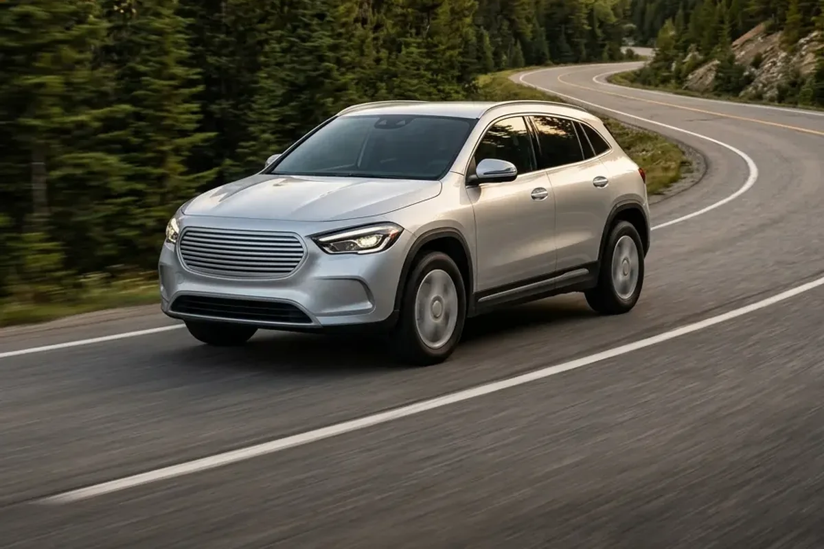
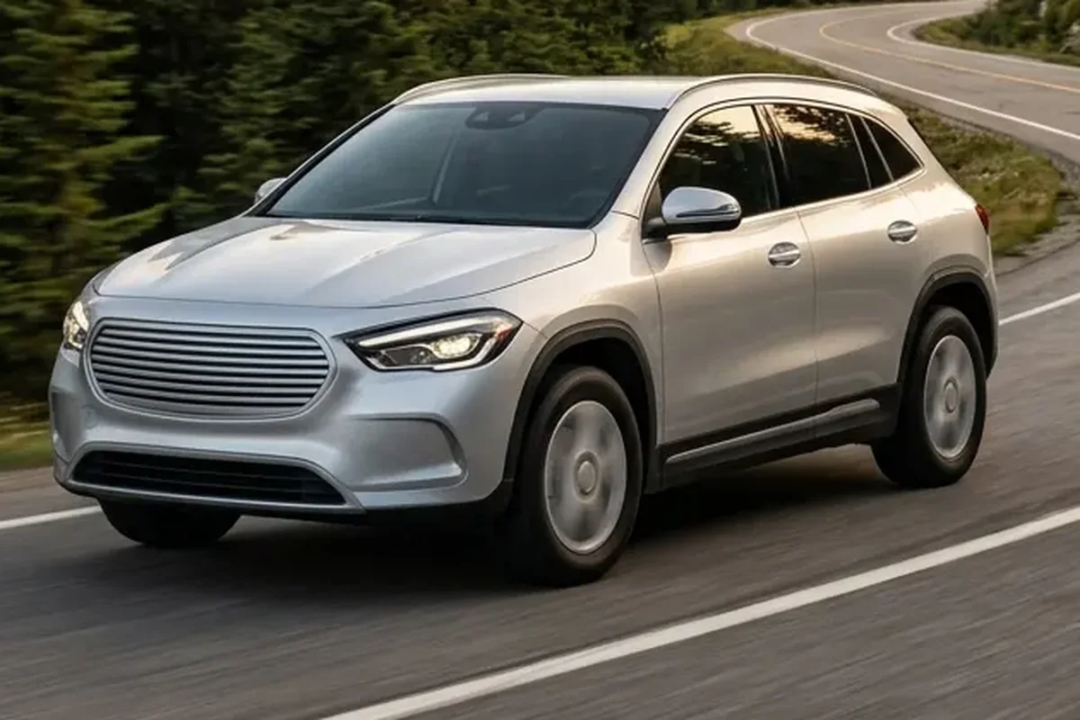
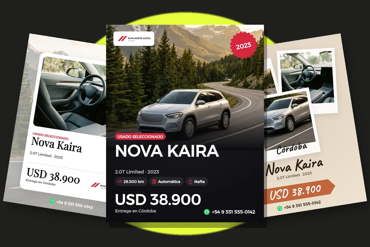
One photo covering at least half. The front three-quarter shot, clean and well lit.
Model and year in large type. It is what people read first as they scroll.
Three facts with icons. Mileage, transmission or fuel, and the extra that sells most (one owner, warranty, financing).
Price. Large, with no fine print. If you prefer not to show it, make “Call for price” just as visible.
Contact and brand. One WhatsApp number or handle, and the dealership logo at the bottom, small.
Sizes for each placement
| Where | Size | Note |
|---|---|---|
| Instagram or Facebook post | 1080 × 1350 px | Vertical: takes up more screen than square |
| Story or WhatsApp status | 1080 × 1920 px | Leave about 250 px clear at the top and bottom |
| Groups and catalogs | 1080 × 1080 px | Square: shows in full in any preview |
Mistakes that make people scroll past
- Three or four small photos instead of one big one: on a phone, none of them reads.
- Thin type over the photo with nothing behind it to separate it.
- The whole spec sheet: a flyer invites questions, it does not replace the listing.
- A different design for every car: with one consistent look, your posts get recognized.
Flyers that follow the first one
Besides the launch flyer, status flyers work well: “Just arrived”, “Price drop”, “Pending” and “Sold”. They use the same photo and design with a banner that changes. Posting your “Sold” cars shows movement and brings inquiries for the cars still available.
Build one template with your colors and logo once, and change only the photo and the details for each car.
See examples: car for sale flyer