The cover: the photo that gets the click
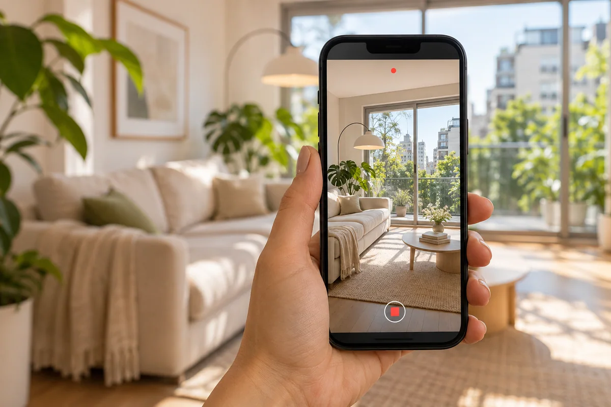
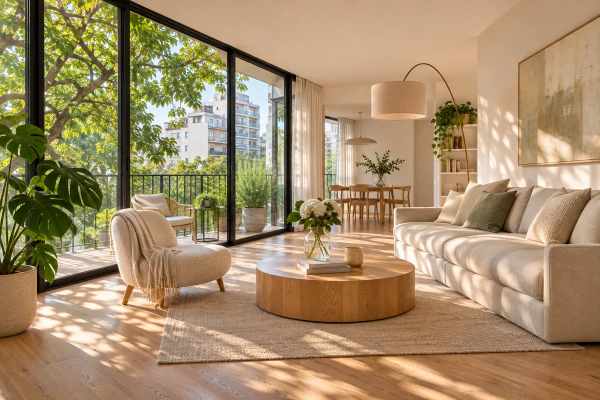
In listing results or a feed, people see a small photo next to a hundred others. The winner is the one that reads in a second and makes them want more: a bright living room, a view, a green balcony, a large kitchen.
Use the front as the cover only when it is the best part of the property (a house with a garden, a building with architectural value). For an apartment it almost never is.
The order of the rest
That order mimics a viewing: whoever looks at the photos feels they are walking through the property instead of jumping around.
The cover: the best the property has.
The whole main room, from the corner that shows the most space.
The kitchen.
The bedrooms, from the primary to the smallest.
The bathrooms.
Balcony, patio, terrace or garden.
Shared amenities, if they add value (pool, gym, grill area).
The front and the street.
The floor plan, if you have it: it is one of the most viewed images.
The ones to leave out
- Dark photos or blown-out windows: they make the place feel small and gloomy.
- Two nearly identical photos of the same room.
- Details that say nothing (an outlet, an empty corner).
- Photos with people, pets or personal clutter.
- Crooked photos: walls should be straight.
How many photos
15 to 25 for a typical apartment or house. Fewer than 10 makes people think something is being hidden; more than 30 is tiring and the best ones get lost.
Enhance without misleading
Fixing light, color and crooked lines is fair and makes a big difference. What you should not do is change the property: enlarge rooms, remove walls or invent a view. Buyers find out at the viewing and trust is gone.
Resaltalo enhances your listing photos (light, color and sharpness, without inventing anything) and picks the best cover for each piece. Paste the link and compare before and after in the free preview.
See examples: enhanced photos